EXPANDING PRODUCT LINE IN THE USA & UK
Naturally DuWop
Launching a New Collection for the "Natural Beauty" Market with Brand Strategy & Packaging Design
Scope of Project
Brand Strategy
Sales Deck
Packaging
Print Production
Sell Sheets
Photography
Web Banner
Email Marketing
Display Design
Illustration
Challenge
DuWop Cosmetics, an independent beauty brand in the industry for over a decade, needed to diversify its audience and expand its market share. With an indie budget and short on time, it needed to launch something new that would show buyers and consumers that DuWop was still innovating and keeping up with market trends. With several hero products they wanted to develop something that fit within their collection but was also new enough to make a splash with their buyers and customers.
Solution
Our Creative Director, Kat, with her thumb on the pulse of consumer trends and movements, knew introducing a natural collection would open up DuWop to a growing market of consumers seeking "clean beauty" and natural products. The solution was to develop a cohesive identity system for a natural collection that also tied into the overall existing DuWop identity. Over time, DuWop could develop and release new "natural" products to add to this collection.

The Hummingbird
Inspired by a true story of a hummingbird making her nest outside of the DuWop headquarters, we designed an icon that would be used to indicate when a product was made with all naturally derived ingredients. For existing products in DuWop's collection, stickers could be added to packaging if they met the natural qualifications. For new products, the hummingbird would be printed directly onto packaging. This allowed DuWop to offer a wider range of inventory to buyers only interested in natural beauty.
Retail Display Mockup
To showcase to current retailers how the DuWop displays would be updated, products were organized into three distinct collections, 1) Naturally DuWop, 2) Venom, 3) Modern Beauty. The top shelf would feature four new all natural products in new packaging, front and center. Other natural products in their current line would also be on this shelf, marked with the hummingbird sticker. Illustrations of the natural ingredients and their benefits would also be featured on the signage. We also used color to help customers identify the various collections.

Packaging
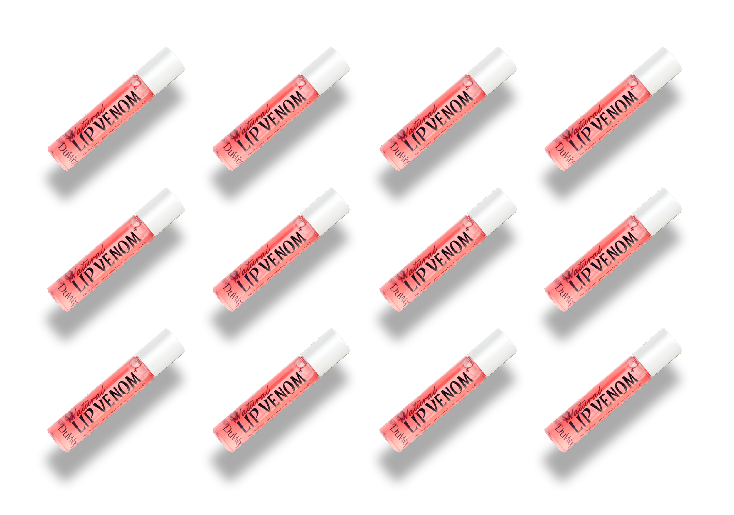
DuWop's existing packaging consisted of a few key elements we had to work with to keep an overall identity system intact. We removed the metal cap from the tube for Natural Lip Venom making it easier to recycle. For the unit cartons we designed a gradient and accented sides with a matte, pink foil that would clearly set the collection apart while still fitting in with the larger family of DuWop products. The hummingbird icon was printed on the tops of the packaging so they would easily be found in back-stock and on display shelving units.


Product Photography
Sell Sheets
We created a number of Sell Sheets for each of the new products DuWop developed for the Natural collection that were attached with a presentation about the new launch. *At this time, we cannot share all of this collateral as the rest of the products are still not publicly launched.

Digital Marketing Collateral
Web Banners & Email Design
Email Marketing


